Google TV Begins Testing Major Homescreen Redesign, First in Years
Google TV Begins Testing Major Homescreen Redesign, First in Years
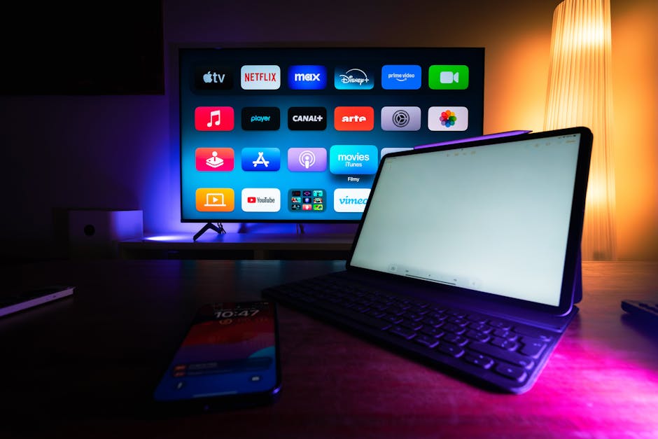
Google TV is reportedly rolling out a significant homescreen redesign, marking the platform’s first substantial visual refresh in nearly five years. This server-side update, observed on Google TV Home v1.0.806977084, introduces notable changes to the user interface, primarily focusing on navigation and accessibility.
The most prominent alteration is to the top navigation bar. The “Library” tab has been removed, and the “For You” tab is now simply labeled “Home.” New pill-shaped containers now house the “Live” and “Apps” tabs alongside a dedicated search button. A separate box contains quick access to settings and the screensaver.
Another key enhancement involves the profile image on the far left. Clicking it now reveals a comprehensive dropdown menu, integrating a profile switcher with direct links to Watchlist, Library, Your services, and Content preferences. Previously, “Your services” and “Content preferences” were buried deeper within the Settings menu under Accounts & Profiles, making this a welcome streamlining of user options.
While not a complete overhaul, this redesign represents a crucial evolution for Google TV’s user experience, which has remained largely consistent since its 2020 debut. The update is currently being tested on a limited basis, suggesting a wider rollout could follow soon.
Disclaimer: This content is aggregated from public sources online. Please verify information independently. If you believe your rights have been infringed, contact us for removal.